<!DOCTYPE html>
<html lang="en">
<head>
<meta charset="UTF-8">
<meta name="viewport" content="width=device-width, initial-scale=1.0">
<title>清新导航跳转页</title>
<style>
* {
margin: 0;
padding: 0;
box-sizing: border-box;
}
body {
font-family: Arial, sans-serif;
background: linear-gradient(135deg, #e5f6ff, #b3d9ff);
display: flex;
justify-content: center;
align-items: center;
min-height: 100vh;
overflow: hidden;
}
.container {
text-align: center;
padding: 40px;
background-color: rgba(255, 255, 255, 0.8);
border-radius: 15px;
box-shadow: 0 10px 20px rgba(0, 0, 0, 0.1);
animation: fadeIn 1.5s ease-in-out;
}
.logo {
width: 120px;
height: 120px;
margin-bottom: 30px;
background-color: #4da6ff;
border-radius: 50%;
display: flex;
justify-content: center;
align-items: center;
margin: 0 auto 30px;
animation: bounce 1.5s infinite alternate;
}
.logo img {
width: 60%;
}
h1 {
color: #333;
margin-bottom: 20px;
}
p {
color: #666;
margin-bottom: 40px;
}
.button-container {
display: flex;
justify-content: center;
gap: 20px;
}
.btn {
padding: 12px 30px;
border: none;
border-radius: 5px;
cursor: pointer;
font-size: 16px;
transition: background-color 0.3s ease;
}
.btn-primary {
background-color: #4da6ff;
color: white;
}
.btn-primary:hover {
background-color: #007bff;
}
.btn-secondary {
background-color: #f0f0f0;
color: #333;
}
.btn-secondary:hover {
background-color: #e0e0e0;
}
@keyframes fadeIn {
from {
opacity: 0;
}
to {
opacity: 1;
}
}
@keyframes bounce {
from {
transform: translateY(0);
}
to {
transform: translateY(-15px);
}
}
</style>
</head>
<body>
<div class="container">
<div class="logo">
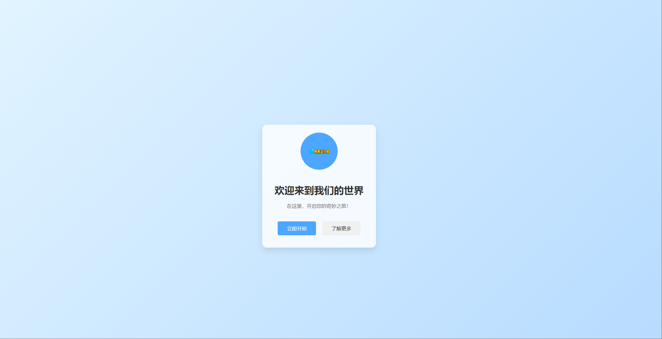
<img src="logo.png" alt="品牌logo">
</div>
<h1>欢迎来到我们的世界</h1>
<p>在这里,开启您的奇妙之旅!</p>
<div class="button-container">
<button class="btn btn-primary">立即开始</button>
<button class="btn btn-secondary">了解更多</button>
</div>
</div>
</body>
</html>


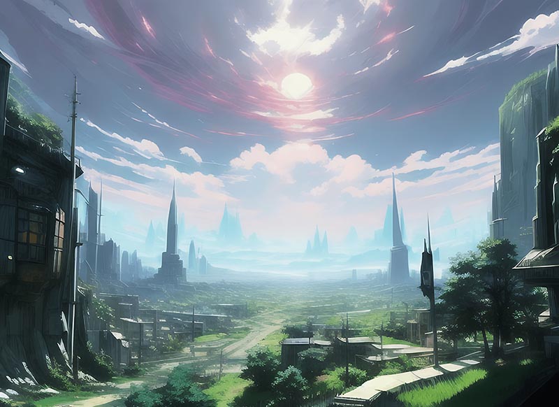


这一切,似未曾拥有