<!DOCTYPE html>
<html lang="zh-CN">
<head>
<meta charset="UTF-8">
<meta name="viewport" content="width=device-width, initial-scale=1.0">
<title>网站正在维护</title>
<style>
/* 全局样式 */
* {
margin: 0;
padding: 0;
box-sizing: border-box;
}
body {
font-family: 'Arial', sans-serif;
background: linear-gradient(135deg, #1e3c72 0%, #2a5298 100%);
color: #fff;
display: flex;
justify-content: center;
align-items: center;
height: 100vh;
overflow: hidden;
}
.maintenance-container {
text-align: center;
max-width: 600px;
padding: 20px;
background: rgba(255, 255, 255, 0.1);
border-radius: 15px;
backdrop-filter: blur(10px);
box-shadow: 0 4px 30px rgba(0, 0, 0, 0.1);
}
.maintenance-container h1 {
font-size: 2.5rem;
margin-bottom: 15px;
animation: fadeIn 2s ease-in-out;
}
.maintenance-container p {
font-size: 1.2rem;
margin-bottom: 20px;
animation: slideIn 1.5s ease-in-out;
}
.maintenance-container .spinner {
border: 8px solid rgba(255, 255, 255, 0.3);
border-top: 8px solid #fff;
border-radius: 50%;
width: 50px;
height: 50px;
animation: spin 1s linear infinite;
margin: 0 auto 20px;
}
.maintenance-container a {
color: #fff;
text-decoration: none;
font-weight: bold;
transition: color 0.3s ease;
}
.maintenance-container a:hover {
color: #ff6f61;
}
/* 动画效果 */
@keyframes fadeIn {
from {
opacity: 0;
}
to {
opacity: 1;
}
}
@keyframes slideIn {
from {
transform: translateY(-20px);
opacity: 0;
}
to {
transform: translateY(0);
opacity: 1;
}
}
@keyframes spin {
0% {
transform: rotate(0deg);
}
100% {
transform: rotate(360deg);
}
}
</style>
</head>
<body>
<div class="maintenance-container">
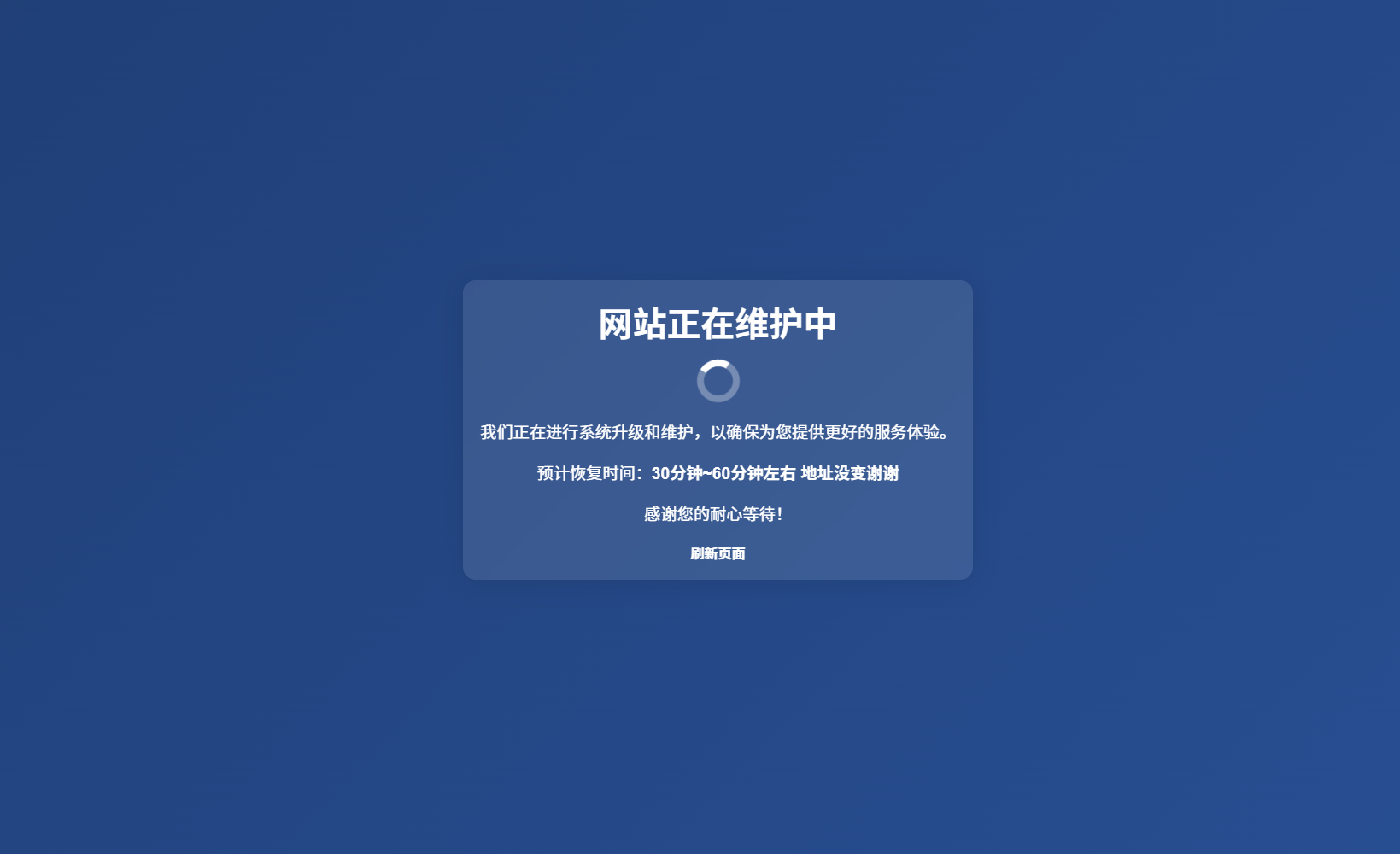
<h1>网站正在维护中</h1>
<div class="spinner"></div>
<p>我们正在进行系统升级和维护,以确保为您提供更好的服务体验。</p>
<p>预计恢复时间:<strong>30分钟~60分钟左右 地址没变谢谢</strong></p>
<p>感谢您的耐心等待!</p>
<a href="#" onclick="window.location.reload(); return false;">刷新页面</a>
</div>
</body>
</html>


这一切,似未曾拥有